A popular web design technique swaps images and pictures as you go down rows on the page. It looks great on desktop, but often leads to a strange look on mobile. There needs to be a way to reverse the order of some columns. As I was building in Elementor, that's what I'll discuss here.
If you don't have Elementor installed and active, please start with our tutorial here, then come back to this.
How do you do responsive column ordering in Elementor?
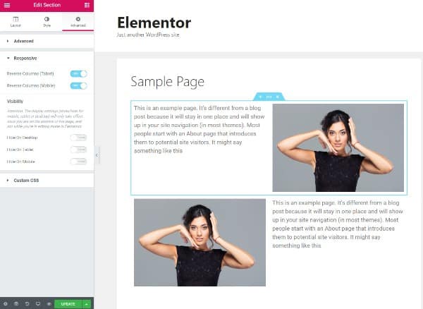
- Right click on the row
- Select Edit Section
- Click the Advanced tab
- Select the Responsive dropdown
- Toggle Reverse Columns (Tablet) and Reverse Columns (Mobile)
- Click Update
Allow me to illustrate.
What responsive ordering looks like
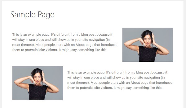
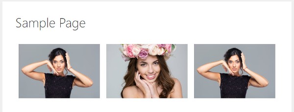
The alternating images and text usually takes a form like this:
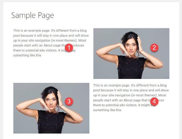
You might have half columns or one third picture, two thirds text, but the idea is the same. It serves to break up blocks of text and include some visual flow.
The numbers denote the column order.
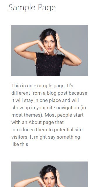
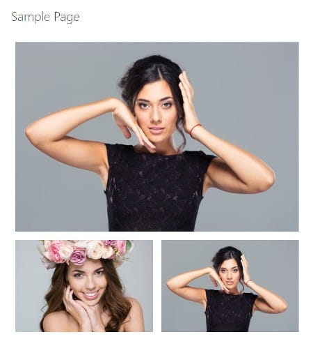
The problem comes when you view this on mobile. It turns out like this:
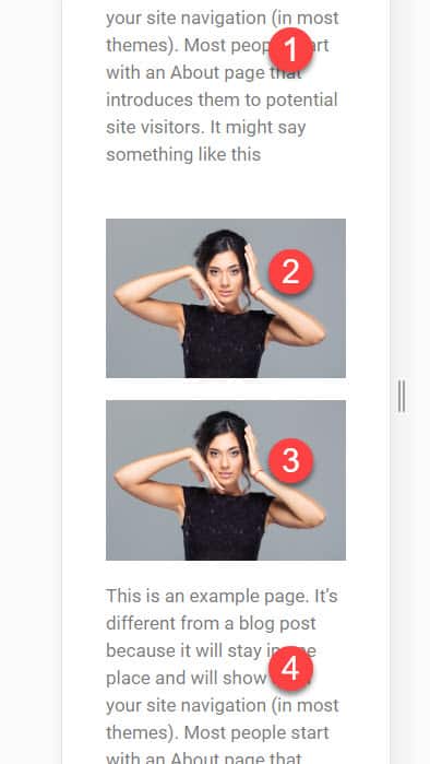
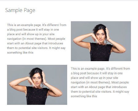
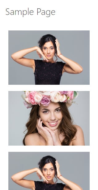
If that's what you're going for, great. But more likely you want it to be picture, text, picture, text. Something like this:
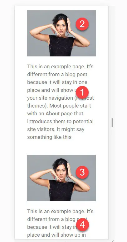
To achieve that look, you need to reverse the column order of the first row, but not the second. To do this in Elementor, refer to the steps at the top of this tutorial, which looks something like this:
Make sure you test your design on different size screens to get the look you're after. If the columns are 50%, you might not want to reorder them on tablets.
How to responsively change the column widths
If your design looks unbalanced on a tablet, you might need to change the column widths responsively. You might want the following sequence...
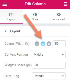
How do you change the responsive column widths in Elementor?
- Hover over the element you want to change
- Right click the black column icon
- Select Edit Column
- Click the grey desktop icon next to Column Width (%) to show the tablet and mobile icons
- Select the tablet or mobile icon
- Change the percentage width in the input box to the right of the icons.
If you wanted to make sure the columns were full width on tablets, you would make this responsive column width 100. On mobile, this is set to 100 by default.
Where responsive column width editing really comes into its own is when you have three or more columns. These usually don't squash nicely on tablets. You usually won't want more than two columns on a tablet.
By using the responsive width editing, you can get this sequence:
The way to get this sequence is, on the tablet responsive width, set the first column to 100 and the other two columns to 50.
If you need to hide one or more of the columns responsively, I've written a tutorial on that here.
I hope you found this tutorial useful. It's simple techniques like this that can really make your design stand out on all screen sizes.

Thanks Mike for this post. It helped me a lot.
Thank you. Easy, but didn't see it!
Merci beaucoup
De rien
Thanks for pointing out this hidden gem!
This post is awesome, thank you !
terima kasih mike.. ini sangat membantu saya.. ini tutorial yang saya cari..
Well explained, thank you very much.
Not used to comment on these but I owe you one! Thank you so much :)
You wouldn't even believe how happy this made me! I must have stared at this option a million times and didn't see it!
Brilliant! Greatly appreciated.
Is there a way for me to swap the column orders between desktop and tablet modes. In desktop, i'm using the order of logo, menu and social media buttons. But in tablet, I need logo, social media and hamburger icon. But I'm unable to do this. Can you help me out here please?
I think you'd probably look at doing a nested inner section for the social media and menu, then you can change the ordering just on those columns, leaving the logo in place.
Or you could do three columns containing the menu, social media and hamburger, responsively hiding the menu on mobile and hiding the hamburger icon on desktop/tablet.
Awsome post! keep it up.
Nice guide :-)