A lot of websites use sticky headers. This is where the header appears to "stick" to the top of the browser window as the user scrolls down the page.
If you have Elementor Pro, you can create a sticky header across the whole site, replacing the current theme header. This has been a feature since Elementor Pro 2.0 launched in April 2018.
I'll also show how to get the sticky header effect on a single page, which is particularly useful if you are using the free version of Elementor.
If you haven't already, make sure you have Elementor installed and active.
How to make a sticky header in Elementor Pro
- Add a new Header template in Elementor Theme Builder
- Choose a pre-designed header, or design your own
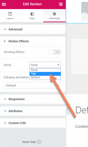
- Edit the header section, then under Advanced -> Motion Effects choose "Top" in the Sticky dropdown.
- Set the screen size you want the sticky header to be triggered
- Publish your changes
- (Optional) Add a condition to display the header across the whole website
Let's go through it step-by-step.
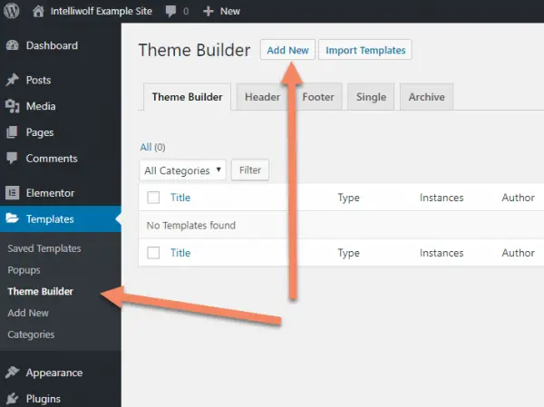
Add a new Header Template
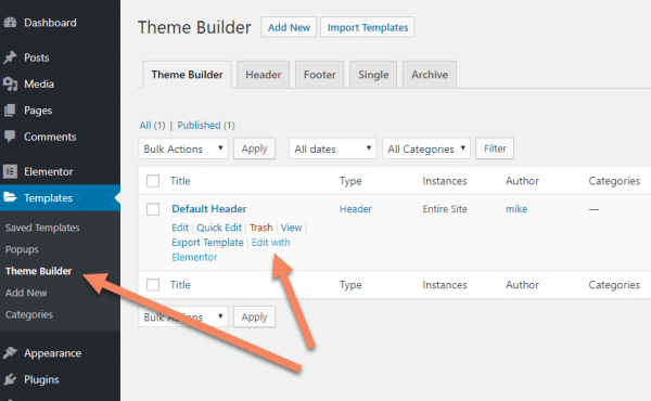
With Elementor Pro activated, go to Templates -> Theme Builder. Click "Add New".
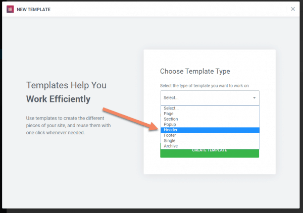
On the popup, select the "Header" Template Type.
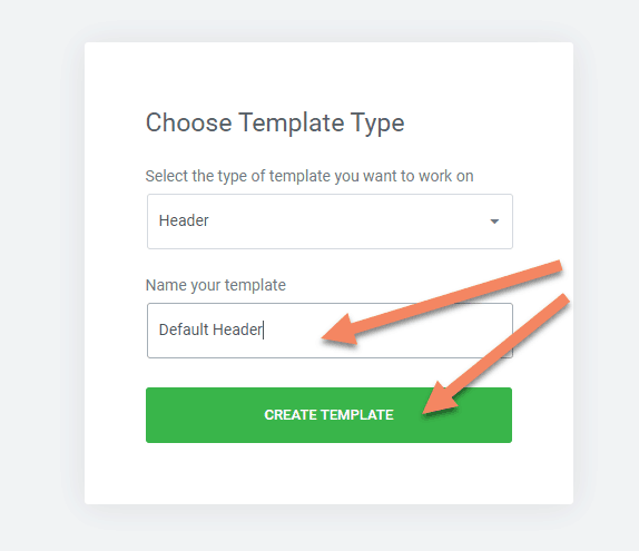
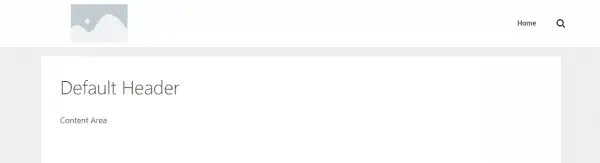
Name your header. Because I'll be using this across the website, I've called it "Default Header".
Click "Create Template".
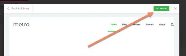
Choose a Pre-Designed Template or Design Your Own
I usually like to start with a pre-designed template and make my own changes. Have a look through the templates provided to see if there's anything close to what you're after.
You can click through the templates before deciding. It doesn't need to be exact, but using a pre-designed template speeds up your development time.
If you've already got your own template imported, you can access it under the "My Templates" tab at the top of this window.
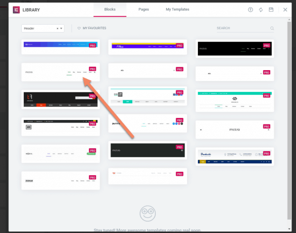
When you find a template you like, click "Insert".
If you don't find any you like, just click the "x" and design from scratch.
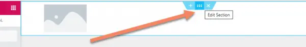
Edit the Header Section
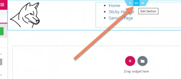
To make the header sticky, hover over the design area til you see the Edit Section. Click the dots to edit the header section.
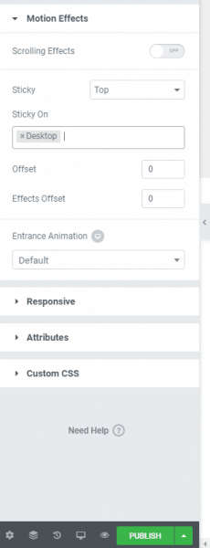
Go to the Advanced tab, open the Motion Effects accordion, then click the dropdown next to Sticky. Select "Top".
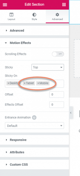
Set Sticky Screen Size Triggers
You generally don't want a sticky header on tablet sized screens and almost certainly don't want one on mobile. So click the "x" next to both under Sticky On, leaving just "Desktop".
Publish Changes
When you're happy with everything, click "Publish". This will set the sticky header live, but it won't replace your theme header yet.
If you stop at this point, you could use this header's shortcode in your theme. You'll find it if you go back to Templates -> Theme Builder in the WordPress admin area.
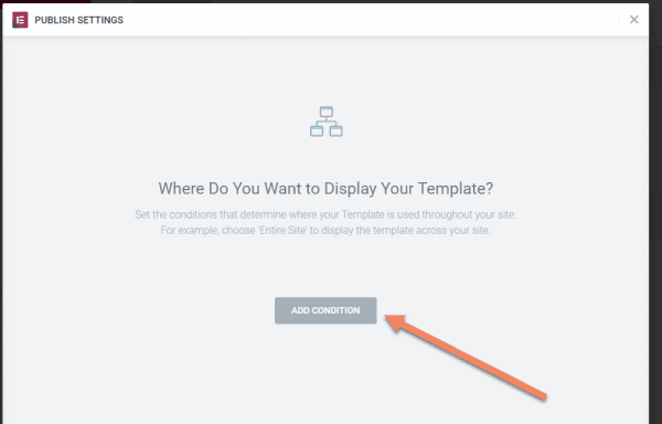
Add Conditional Display
You'll be prompted to add a condition to display the header across the website, or just in certain sections.
If you'd like to replace the theme header with this sticky header, click the "Add Condition" button. Otherwise, click the "x" at the top of the popup.
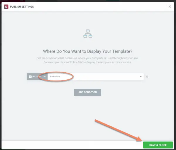
"Entire Site" is selected by default, but you can click the arrow next to it to see other options.
Click "Save & Close".
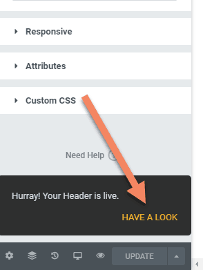
On the bottom left, you'll get a temporary popup to see how the new header looks. Click "Have A Look".
You'll see the header in place. It probably won't have enough content to scroll, so you probably won't be able to see the sticky header effect. Just open up a longer page, like the Sample Page to see it in action.
How to Change Header or Display Conditions
If you want to make changes to the header, go to Templates -> Theme Builder and find you header.
You edit it with Elementor in the usual way.
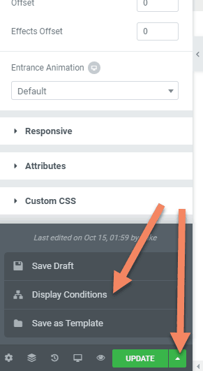
It can be a little non-intuitive, but to change or remove the Display Conditions, you edit the header in Elementor and make any change to turn the "Update" button green and clickable.
Next to the "Update" button, you'll see an arrow. Click that to pull up the options menu. Click "Display Conditions" to make changes to the Display Conditions.
How to make a sticky header in Elementor Free
- Create the header as a row in Elementor
- Add CSS IDs to hook into
- Use custom CSS to set the header row to fixed position in WordPress Customizer -> Additional CSS
The idea behind this method applies to any page builder, or even custom HTML.
Essentially, you're creating the row somewhere on the page, then pinning it to the top of the browser using a bit of custom CSS.
If you just want the code, scroll down to the customizer section.
Let's walk through the list, step-by-step.
Create the header as a row in Elementor
Open a new page, or the page you're already working on, in the Elementor Editor.
Ideally, you want this page to not have any header from the theme, and to be full width. For this demonstration, I'm selectively turning these elements off using the GeneratePress Theme. Each theme will have its own way of handling this, or you may need to create a blank template page in your Child Theme.
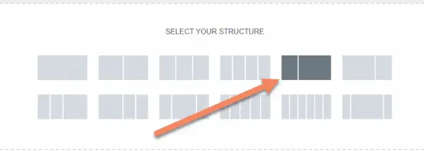
Create a new row.
For this demonstration, I'm using the 1/3, 2/3 structure, with the logo on the left, but design this however you like.
Drag the image block into the section for the logo.
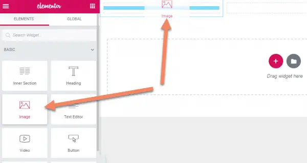
Add your logo, set the image size and alignment. Add a link to the homepage too if that's in keeping with your theme.

Search for "menu" in the blocks to get the Navigation Menu. Drag it into place.
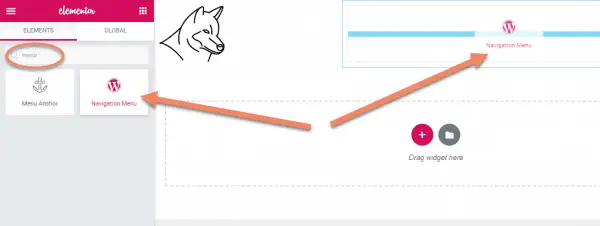
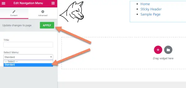
Change the menu to your usual menu for this site, or create one for this.
Don't worry if it looks pretty terrible right now. We'll fix it later with CSS.
Add Custom CSS IDs
While still editing the Navigation Menu, go to the Advanced tab and add a custom CSS ID. I am using sticky-top-menu for this demonstration. You can use anything meaningful and unique, just remember it for the CSS section.
Click "Update".

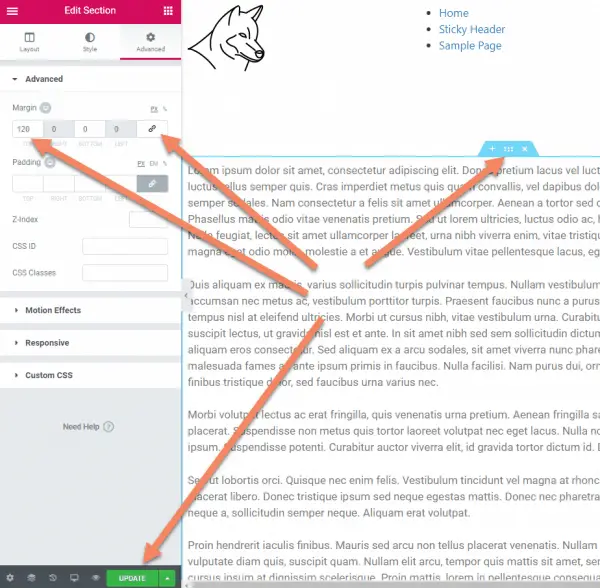
Next we need to add a CSS ID to the whole row.
Hover over the row and click the dots to edit the section.
In the Advanced tab, add a custom CSS ID for the row. For this demonstration, I'm using sticky-top-header. Just make sure it's unique to the page and easily recognizable.

For this demonstration, I'm adding a few paragraphs of text, just so you can see the sticky header in action.
At this point, you'd add whatever else you were planning to the the page. Or skip to the custom CSS section.
You'll need some padding between the content and the header. Either use a spacer or increase the top margin. For this demonstration, I'm increasing the margin.
Once we fix the header to the top, it will be like it is laying over top of the rest of the content. Everything else will be pushed to the top and it'll look a bit messy.
There are cases where you might not want to put a space here. A pretty common one would be where you have an image as the top of the content and a transparent header.
Use Custom CSS in the WordPress Customizer
Once you've got the header row in place, navigate to the front end of that page.
In the WordPress Admin Bar, click Customize.
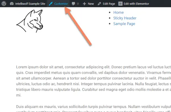
Go to the bottom of the Customizer menu and click on Additional CSS.
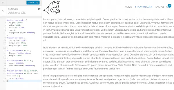
Add the following code to your CSS. You may have to change the IDs in this code if you used different IDs in earlier steps.
#sticky-top-header {
  height: 123px;
  width: 100%;
  position: fixed;
  top: 0;
  background-color: #ffffff;
  z-index: 10;
}
#sticky-top-menu {
  text-align: right;
  margin-top: 20px;
  margin-right: 30px;
}
#sticky-top-menu ul li {
  display: inline-block;
  margin: 10px;
}
#sticky-top-menu ul li a {
  color: #222222;
  text-transform: uppercase;
}
#sticky-top-menu ul li a:hover,
#sticky-top-menu ul li.current-menu-item a {
  color: #1e73be;
}
The #sticky-top-header {} section makes the header sticky. The rest just makes the menu look nice.
This is how it should look, if everything went to plan.
Notice the gap between the content and the header has disappeared beneath the header.
Notice that when you scroll, the text goes under the header, while the header stays in place, stuck to the top of the browser.
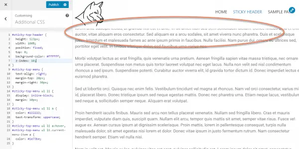
If you don't do the z-index in the #sticky-top-header{}, the header will sit behind the text, which might be what you want.
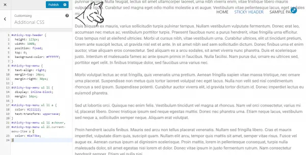
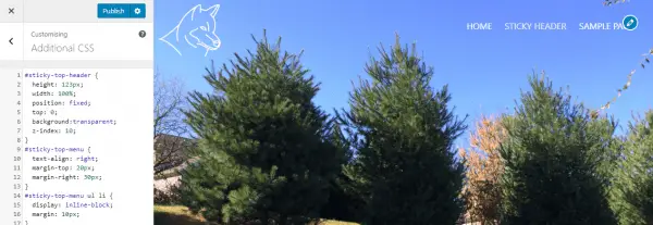
If you want a transparent header, change
background-color: #ffffff;to
background:transparent;After changing the top part of the content to an image and adjusting text colors for a new background, you'll end up with something like this.

Nice man. i like how you made the transparent sticky header for elementor free. There are themes like oceanwp that can offer that out of the boxc but this gives your more flexibility. Thank you for sharing this
Thank you, Mike!
It works like a charm.
This tutorial really help me.
Appreciate!
M.
Thank you! It worked first time and it was so easy to set up.
Really appreciate it.
hello , thanks a lot for this , it works great. but my problem is when it comes to mobile phone. gets sticky there too but i cannot edit it differently so it ends up looking but at the phone
There's a setting to choose where the header is sticky. Just unselect mobile.
Bless you, Mike! After 3 weeks of going back and forth on the internet for a solution to a sticky header in Elementor Free, your solution took me less than 10 minutes to solve my problem! My only question is, what do I need to add to the CSS to make my sticky header blur as the text goes under the header during scrolling?
Have a look at animation: blur, with two different values for the points in the scroll.
It's the easiest solution with a nice illustration ever I found on the web. The sticky trick for the free elementor plugin is cherry on the cake.
I’ve seen it done that a menu will have an all white text menu like yours in front of a video background, but then when the user scrolls down the screen, the header text and log darken to black and a smaller rectangular white background appears behind the text. Is there a way to do that?
There sure is. I wrote a tutorial on how to to it here: https://intelliwolf.com/add-transparent-sticky-header-elementor/